Archived on 6/5/2022

Topic Previews

anon5422159
11 Jul '16

UPDATE: after feedback, the excerpts and buttons shown below have been reverted

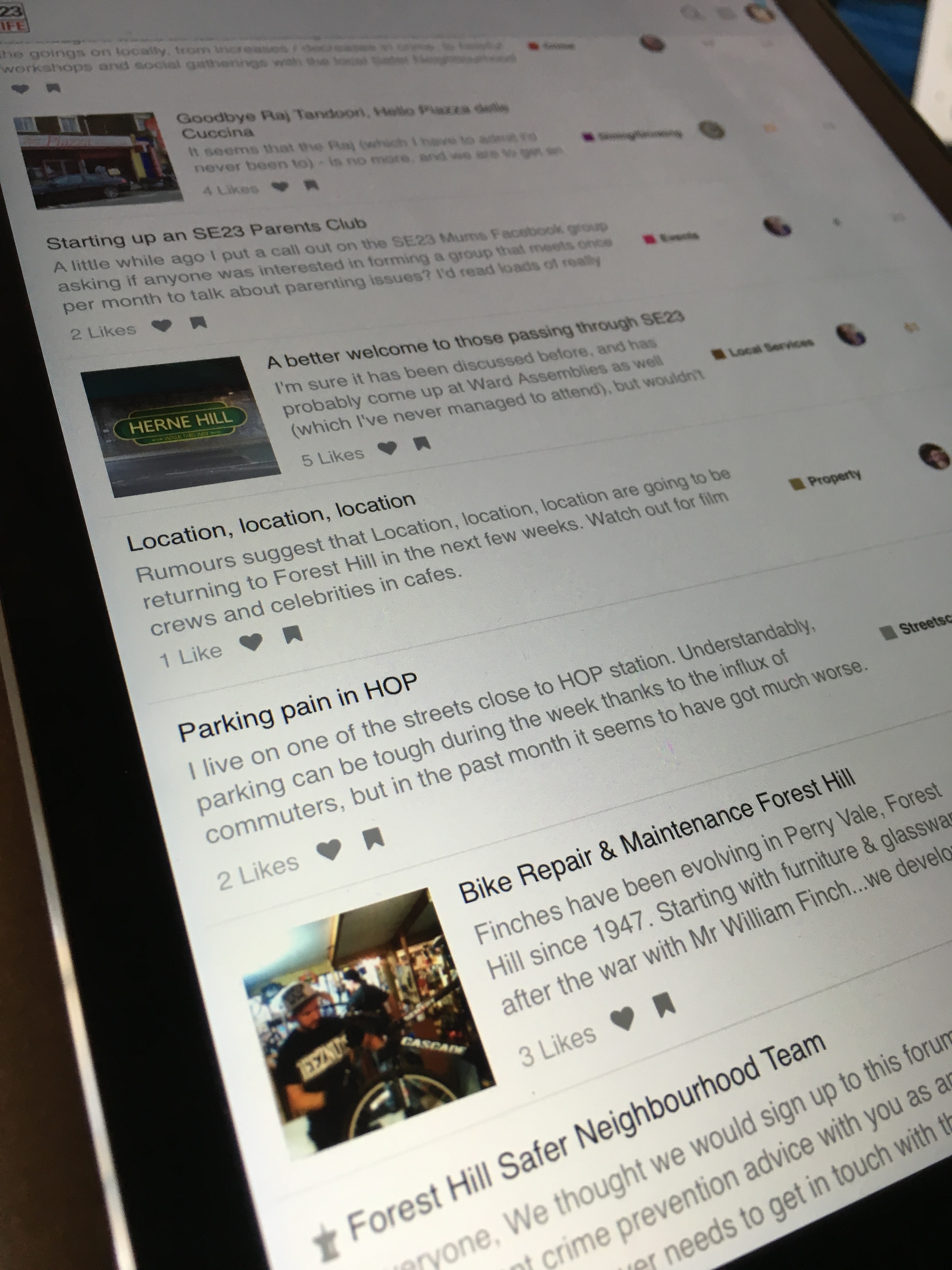
I’ve just installed a plugin which makes the homepage look richer on tablets and desktops. You should now see this:

Let me know if you see any issues with this. We can individually enable/disable the following:

  • thumbnails for topics
  • excerpts for topics
  • bookmark and like buttons.
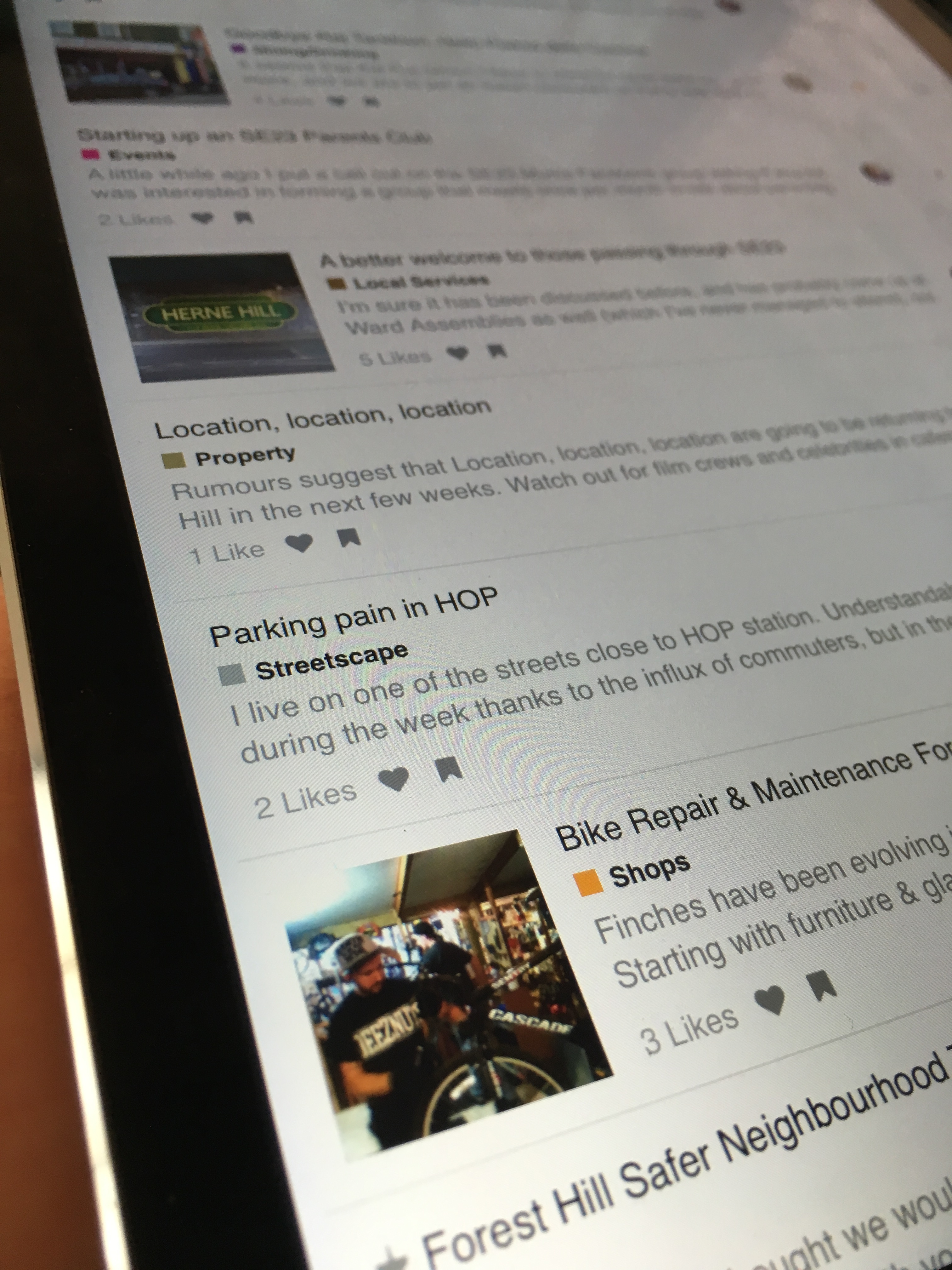
  • category badge shown under title (currently disabled)
  • :+1: I like all the changes
  • I’d prefer to hide the excerpts
  • I’d prefer to hide the images
  • I’d prefer to hide the like/bookmark buttons
  • I’d prefer to have the category shown under the titles (as opposed to a column)

0 voters

This is how it would look with categories under titles (note: shorter excerpts):

RachaelDunlop
11 Jul '16

Don’t know if it’s related, but since the new features were added I’m being taken to the last post in threads, not the last post I read (if that makes sense!).

anon5422159
11 Jul '16

It’s a bit of a hidden feature, but there are three ways to navigate in to a topic, and they affect what position you’re taken to:

Is it possible you tapped the last activity date as opposed to the title?

I tried to test this to recreate the issue you saw but it’s a bit fiddly as my account is up to date on all topics, and my test account @AmyFoster isn’t up to date on any topics :grimacing:

RachaelDunlop
11 Jul '16

Possibly. I’ll keep playing around with it. I might be tapping differently if I’m tapping the snippet rather than the title.

comoed
12 Jul '16

For me the font of the description/blurb is too big, which means that you get less topics per page. Id prefer smaller text so there were more topics per page. Also with a lager differentiation in font it would be easier at a glance to distinguish between the heading and the blurb. However I do realise that taste is just a matter of taste - and that what I like is not always what others like. The site is still very useable either way.

anon5422159
12 Jul '16

I did wonder if people would prefer to see more topics per page. Let’s wait till we get a few more votes in the poll on my previous comment and I’ll go with the majority whatever you decide.

I’ll also have a fiddle with the CSS to see if I can reduce the size of the excerpt font.

anon5422159
12 Jul '16

I’ve reduced the size of the blurb text. Also got rid of the like/bookmark buttons, which should help get more topics on the page. Thanks for the feedback, Ryan

comoed
12 Jul '16

Well, I dont know about anyone else - but I like the changes! :+1:

Londondrz
12 Jul '16

My only thoughts are that the local services section is now harder to search. We used to have sections with an outline for each sector which were very clear. Unless this is now in a different section and I am being myopic again :grinning:

RachaelDunlop
12 Jul '16

On my laptop I now get five topics the view. Not enough, in my opinion, but other’s may disagree. Also, I’m not sure how useful the snippet is on long threads when it shows the first post. However, I do like the tweak to make the topic heading bigger and snippet smaller. Much easier to see what’s what now.

anon5422159
12 Jul '16

I see from the poll you’re not alone in thinking this.

There is an option to enable/disable excerpts on a per-category basis. Some categories, like “local services” for example, don’t really need an excerpt, as “builder recommendations” is self-explanatory. I’d hoped this level of customisation would work on the homepage, but it doesn’t. It only affects the individual category pages unfortunately. The homepage excerpts setting affects all categories regardless of their individual setup.

I’ve disabled excerpts for now.

Brett
12 Jul '16

Am not sure about the change yet but am puzzled by a couple of issues:

  1. It is not clear what drives the new behaviour. In order to answer this thread, I opened a new browser window but got the old style look (Chrome in both cases).
  2. In the new style it looks like the refreshing feature does not work. I would prefer to retain this over and above any of the other cosmetic changes.
anon5422159
12 Jul '16

Sorry for the confusion, @Brett - you won’t now see all the changes because I have now reverted some of them after feedback.

I have updated my original post above to reflect this.

The auto-updating of new topics should still work. I’ll do some testing around this. Thanks for letting me know.

anon5422159
12 Jul '16

@Brett and others - to see how the excerpts look, check out the Site Feedback category on your tablet / laptop / desktop. I have enabled excerpts just for this one category page.

Brett
12 Jul '16

I think that I preferred the clean look without the excerpts, especially as more topics can be seen on one page. I can see that they could be useful though - could these be made to popup when the mouse hovers over the topic heading?

anon5422159
12 Jul '16

This may well be possible using an existing plugin. A list of available plugins is maintained by Discourse here:

We can also write our own. I’m happy to work with you, @timlund, and other SE23 techies to write open-source plugins for SE23.life if you have ideas you’d like to explore. I’ve cut down my work-days at Morgan Stanley so I can spend more time improving the technology behind this forum (and also because I prefer spending time in all the local cafes eating cake and drinking coffee) :slight_smile:

This is my first tentative foray into writing a Discourse plugin:

https://github.com/chrisbeach/discourse-plugin-stripe

It’s work-in-progress (no validation or security implemented yet), but when finished will be part of a slick payment system for commercial posts here on SE23.life. I’ll also be implementing a server-side app which handles the payment callbacks and automatically posts to the forum.

Brett
12 Jul '16

Would prefer to find an existing plugin than get my hands dirty with Java right now :wink: - have enough development work on my plate. Did a quick search and it seems the excerpt on mouseover used to happen:
https://meta.discourse.org/t/latest-posts-posts-wall/5414/5

There may well be other ways to achieve the same sort of affect. Perhaps shorten the excerpt and place on same line as heading or only show excerpts on followed topics?

anon5422159
12 Jul '16

After I’ve finished the payments stuff I’ll fork the “topic previews” plugin and will make the excerpt length configurable. May also try to make it configurable per-user.

armadillo
19 Jul '16

Hi @anon5422159, is there a way to optionally exclude the excerpt images from the thread list? I find them distracting tbh, and after the first viewing, I don’t really find they add anything to an ongoing thread where the latest posts are of most interest. I pretty much felt the same about the excerpt text when that was visible.

That being said, I can however see the benefit of the excerpt info for posts within the Offered category, where the first post is basically the thread.

anon5422159
19 Jul '16

Hi @armadillo, changing the settings on a per-user basis wasn’t possible, so I just whipped up a “userstyle” for you that you can optionally install in your browser to hide the images:

I’ve also made the excerpt images 50% transparent to make them less “in-your-face”

armadillo
19 Jul '16

Thanks @anon5422159, but i’m guessing that’s not going to work on my iPad & iPhone - my social media consumption devices of choice :disappointed_relieved:

armadillo
19 Jul '16

Oh… and just as an aside - I’d be wary about making constant changes to the look and feel of the main site - one thing I’ve learned in my past 10+ years of UI usability design is that if there is one thing users hate is change.

Much better to have a beta/test area to play in, and slowly migrate successful changes over.

Londondrz
19 Jul '16

Armadillo, Chris is a fully paid up Apple fanatic so don’t worry, he will sort it.

armadillo
19 Jul '16

I bet I can out apple him :slight_smile: At last count we have 2 iPhones, 3 iPads, 2 mac books, an iMac and a Mac Mini… oh - and 2 apple TV’s, 2 air port express and an air port extreme … and 1 apple watch… and I still don’t qualify for a bulk discount !!

Actually, that list is a bit of an eye opener… and not necessarily a good one at that :frowning:

anon5422159
19 Jul '16

The site shouldn’t show excerpt images on your iPhone at all. If it does, it may be because you’re in “desktop view” as opposed to “mobile view” (this is selectable from the menu in the top-right of SE23.life).

As for disabling excerpt images on iPad I’m afraid you’re right, and userstyles aren’t available on iPad. The plugin that provides excerpts and thumbnails may one day be customisable on a per-user basis. I’ll let you know when it is.

I hear what you’re saying about changes to the site design. I have deliberately held off installing the multitude of plugins available for Discourse, and am making changes at a fairly slow rate (and holding polls afterwards, and listening to feedback). A public beta site would be good. I’ll set one up when I get the chance.

Londondrz
20 Jul '16

Ha! Apple sucks Chris :joy:

anon5422159
11 Oct '16