I was asked a very interesting question by @Gary_Brown earlier and I think it is worth bringing your attention to this issue because it is one of those built-in “cool features” of this forum’s software
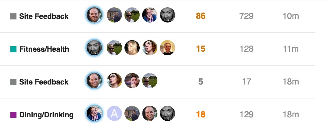
You might have noticed (as Gary did) that on the front page, the line for each of the topics includes:
- the title
- the category
- the photos of the most frequent contributors
PLUS - the number of replies & likes
- the last time it was added to
One interesting thing to note is the colour of the replies number. Some are orange, some are brown, some grey.
The idea is that this number gives you an indication of how “HOT” a topic is. The site calculates the number of likes on the posts in the thread compared to the number of replies. If lots of people are liking the replies, then the topic is seen as more exciting, so it gets hot … and therefore changes colour.
Hopefully this will help you see that what you do really matters - so please like, comment, or report but also that you can see at a glance what others are interacting with - not just the number of replies, but who thinks these are useful or not - is it worthwhile, or just members shouting at each other
Hopefully this makes your interaction here easier, more fun and more useful


