[DRAFT - visible to @FH_Mural members - feedback welcome before the poll is opened to all members in the main forum]
Forest Hill will soon be sporting a new crowdfunded mural in the railway underpass (details here).
After a call for design submissions, we received a design from @Lionel and also a version of this design tweaked by @Armadillo. There were no more costed submissions received before the deadline.
Check out the options and please vote for your favourite in the poll below.
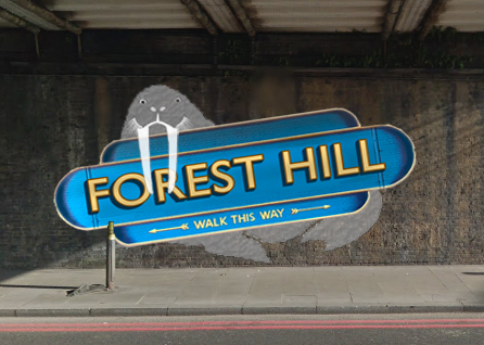
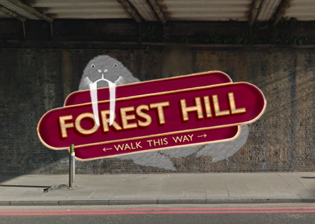
Option 1: Traditional
Design by @Lionel
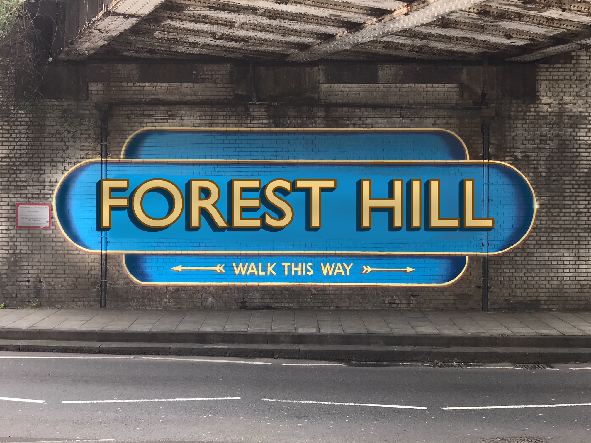
Colour variant:
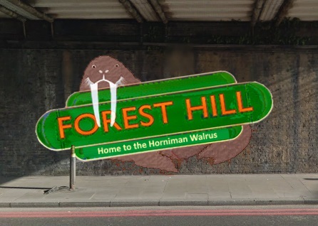
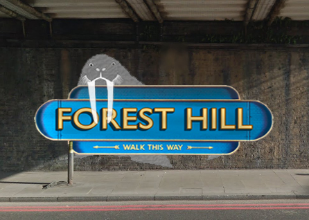
Option 2: Traditional, with a touch of Walrus
A tweak of @Lionel’s design by @armadillo, featuring the famous Horniman walrus
Note: this option adds a further £250 to the cost (extra colours for Walrus and extra marking out time as the horizontal design uses the brickwork for quicker marking out).
Colour variant:
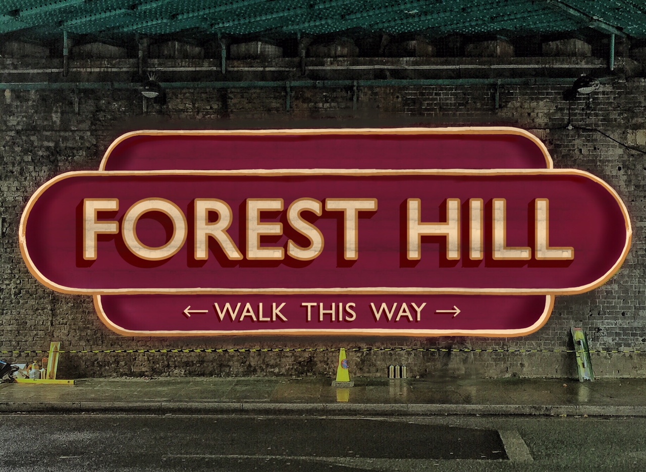
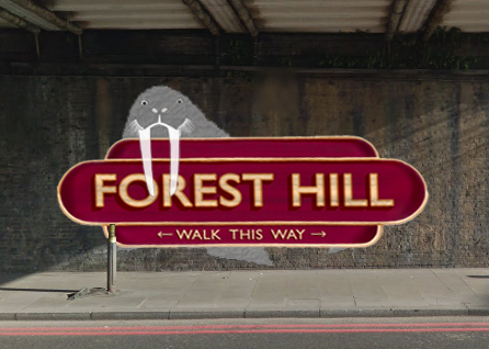
Option 3: Traditional, with a touch of Walrus
As per option 2, but with straight sign:
Colour variant:
Place Your Votes!
Polling ends on January 1st 2018
We’ll then have a second quick round of voting to choose the colour.