Forest Hill Station 1900s-1972


How can anyone prefer the minimalist glass cube of today’s Forest Hill station to the amazing elaborate station of Victorian times?

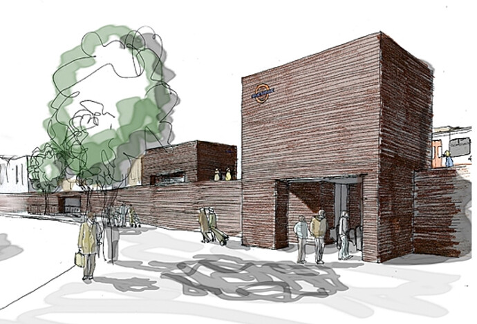
A real loss sadly. But rather than look back I’d prefer to look forward to a Forest Hill urban renewal including a new station as described by the Forest Hill Society and Discourse Architecture.


I’d much prefer a light, airy,forward looking piece of modern architecture than something that only references Victorian buildings (though I do love those).
The image above is more a concept, as I understand it, so it’s not fair to brand it dross.
The original station was incredible, but it would be incredibly expensive to build something of that scale and (presumed) build quality today. Far better to build in the spirit of the Victorians - looking confidently to the future - than to mimic their style, which is impractical for today’s needs.

Could you explain what is light, airy and forward-looking about the dark wooden, windowless sarcophagus in the concept art above? Perhaps I missed something?

It’s a fine balance.
Too many nods to the original architecture and you get something which could feel remarkably dated. I was no fan of the trend in postmodern architecture of the 80s or 90s. It’s a personal viewpoint but to me those buildings are the architectural equivalent of big shoulder pads and leg warmers.

No idea - assuming its a concept drawing (as I mention in my original comment), rather than an actual architectural plan, the “sarcophagus” can’t actually be taken as an indication of what the proposed building would look like. It simply lays out possible shapes or textures, and as such, can’t be seen as anything like an indication of what a final building or design might look like.

Though in context of the concept drawing, I do like the nod to the Forest through what does look like the incorporation of a wood paneling or detailing.

A structure made of ivory, a nod to elephants…

Do we have elephants in Forest Hill?
