Archived on 6/5/2022

Lock down starting to work?

ForestHull
12 Apr '20

I’ve been watching the graphs Public Health England publishes for a while e.g. ArcGIS Dashboards Classic

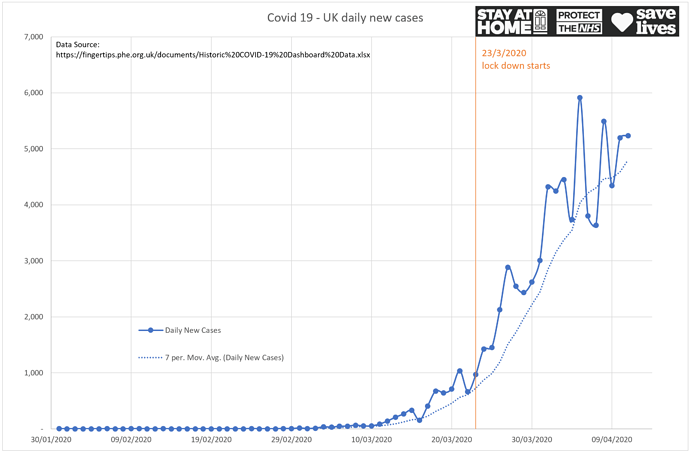
However I don’t think they are the best visualisation of the data, so like lots of other people, I’ve made one of my own. Particularly I think there was a bit of a 7-day pattern in the early data, having less new cases reported over the weekends for some reason (less testing, or lab capacity?), so I added a 7-day average moving trend line (dotted), and also labelled up when lock-down started.

This is just the new daily cases plotted, which at ~5k per day it a lot, but I think at this point it’s starting to look like the rate of increase has substantially slowed and is maybe levelling off:

Clearly still a long way to go, and I guess we need to see the infection rate falling, but at least perhaps things are starting to stop getting worse.

Fingers crossed everyone, stay safe!

Thewrongtrousers
12 Apr '20

I think your graph is telling us that the highs may be getting lower. When we start seeing some ‘lower lows’, that may mean the worm has turned.

ForestHull
12 Apr '20

Yes - that’s a very nice way of putting it. Put another way, we aren’t over the hump yet!

Thewrongtrousers
12 Apr '20

Your graph says that we ‘may be’ but the lower lows will indicate a down trend

Thewrongtrousers
12 Apr '20

Try this. The 1-2-3 high test is a good indicator of whether the high point has been reached and whether a downtrend has started. Not infallible but its a good indicator. Not sure if it can be applied to a virus, but its an old tool that has stood the test of time.
http://chartsview.co.uk/learning/123-High.html

Beige
12 Apr '20

That’s an interesting chart.

I decided I didn’t like looking at cases much because is it dependent on testing regime which has been changing over time, so then I thought deaths was a more reliable, if slower, number.

Now I don’t think deaths is actually that reliable because it is dependent on where someone dies and if they are classified as covid-19 deaths, so I would like to look at total deaths (all causes) plotted against expected deaths (say 2019 or some other simple model). Have you seen this data or chart anywhere? The Economist reported on a study from Italy which was v interesting here:

marymck
12 Apr '20

Because of the requirement for the signatures of two hospital doctors, there’s always a delay in hospitals issuing the paperwork that families need to make arrangements for their lost loved ones to be removed from hospital and to enable them to register the death. Self isolation and office closures at this time will also mean delays in death registrations.

The death registration and other interesting statistics are here …

https://www.ons.gov.uk/peoplepopulationandcommunity/healthandsocialcare/conditionsanddiseases

ForestHull
12 Apr '20

I think we’ve had a similar thought process then :slight_smile:

I’ve not seen any graphs comparing Corvid-19 deaths against a seasonal baseline, but then I think picking an ‘average’ baseline is tricky as there is a lot of variability. Here’s the ONS data for ‘excess winter mortality’ for the last 6 years, for example:

Period Excess Winter Mortality
2013 to 2014 17280
2014 to 2015 43720
2015 to 2016 24500
2016 to 2017 34410
2017 to 2018 49410
2018 to 2019 23200

Source: Excess winter mortality in England and Wales - Office for National Statistics

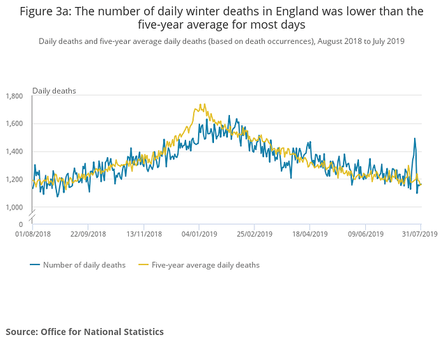
That said, further down the above page we do see the five year average of excess winter deaths by day - peaking at about 1.5k on January 1st. Their graph looks quite different to the Corvid-19 shape though:

ForestHull
19 Aug '20

Some months on, Lewisham have the borough-wide figures for Covid-19 deaths summarised in their Scrutiny of the Council’s Covid-19 Response Report:

So the most recent death in Lewisham was actually back in June.