Archived on 6/5/2022

[Poll] Forest Hill Mural - Choose a Design (Round 2)

SE23.life
1 Jan '18

Wow…

… following the most highly participated poll on SE23.life so far - the votes from the 1st round of voting on the design for the proposed Forest Hill mural are in and much love has been given for ‘a touch of walrus’!!

[Poll] Forest Hill Mural - Choose a Design (Round 1)

(the above snapshot was taken on 1st Jan 2018)

With that decided, all that’s left now is the tricky question of orientation and colour for the traditional part of the design :scream:

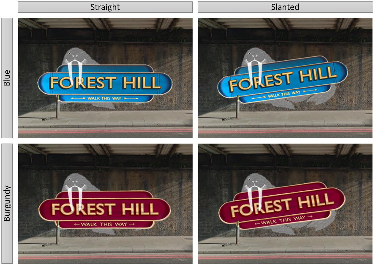
To help answer this, we’re offering up two separate polls for you to vote on before finalising the ’touch of walrus’ design - one each for a proposed Style and Orientation variant.

Click for a detailed summary of the proposed options

Summary of options

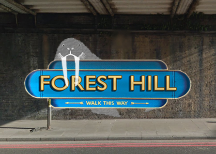
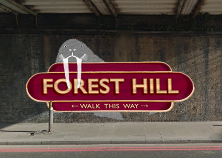
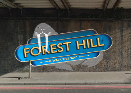
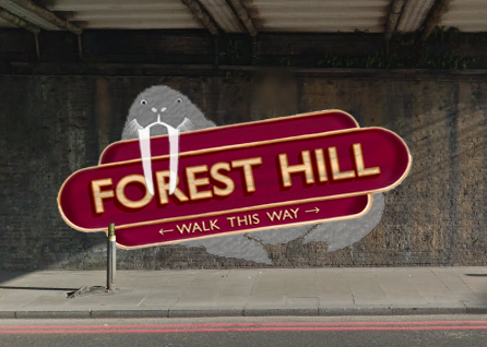
The following colour options were taken from the original ‘traditional’ submission from @Lionel with the orientation options from the ‘touch of walrus’ amendment submitted by @armadillo.

Notes

Some people have questioned if we have agreement from @Lionel (the artist) to adapt his traditional design, and how he would interpret the amended brief of adding ‘a touch of Walrus’.

Well obviously, we obtained his agreement before including the variants in the original vote, and he was then good enough to provide the following clarification, along with a rather better mock-up than mine;


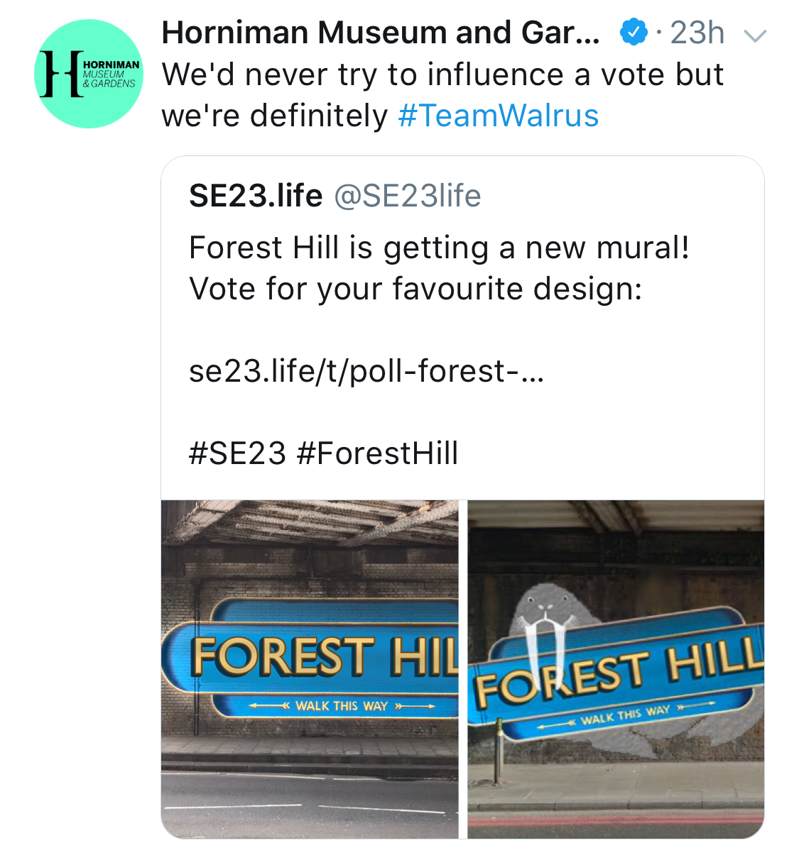
To cover off any concerns around incorporating such an obvious reference to the @HornimanMuseum - we’ve not explicitly asked them about our mural aspirations, but they did declare themselves for #TeamWalrus on Twitter - so we’re going to assume that they’re broadly supportive as well :wink:

Voting closes on 07-Jan-2018, after which the final design will be submitted for crowdfunding.

Remember, if you make a mistake or simply change your mind, you can amend your vote by clicking the ‘Hide Results’ option at the bottom of the poll, and reselecting your option.


Poll 1: Orientation

Straight vs. Slanted

  • Option 1 - Straight

    | straight-traditional-with-wulrus-blue | straight-traditional-with-wulrus-burgandy |
  • Option 2 - Slanted

    | slanted-traditional-with-wulrus-blue | slanted-traditional-with-wulrus-burgandy |

0 voters

In the event that voting is not strongly in favour of either style (within a 45%-55% spread), the artist @Lionel will be offered the final say.


Poll 2: Colour

Blue vs. Burgundy

  • Option 1 - Blue

    | straight-traditional-with-wulrus-blue | slanted-traditional-with-wulrus-blue |
  • Option 2 - Burgundy

    | straight-traditional-with-wulrus-burgandy | slanted-traditional-with-wulrus-burgandy |

0 voters

In the event that voting is not strongly in favour of any particular colour (within a 45%-55% spread), the artist @Lionel will be offered the final say.

SE23.life
1 Jan '18
Michael
1 Jan '18

I like the suggestion that a vote within 45%-55% margin is non-binding. Perhaps we could adopt a similar system for national referenda.

No chance of a green background?

Nadia
1 Jan '18

Yes I was wondering where the blue and burgundy choices came from. They both look nice but so does green …

RachaelDunlop
1 Jan '18

Are we going for a colour not already used by one of our neighbours?

JohnW
1 Jan '18

Yes, what about a green background?

armadillo
1 Jan '18

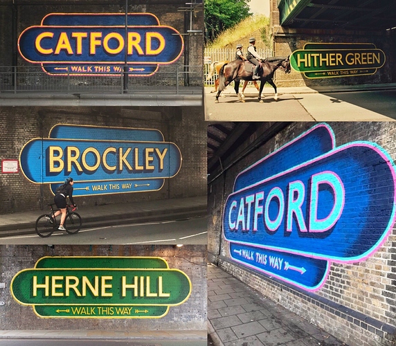
Thats why burgundy would be my preference - Herne Hill and Hither Green already have green signs, Brockley and Catford have blue. Ultimately, its just down to what people think look better.

south-london-murals

Never say never - however, no one felt strongly enough about it to submit a workable variant during the month long call for designs (Forest Hill Mural - Call for Designs (deadline Dec 11th)) - the only colour variations submitted where the original blue and burgundy provided by @Lionel.

Wynell
1 Jan '18

I think blue looks striking and despite others having a blue background, no-one will have a Walrus!
I think others will regret not having a mascot or something more defining than just the location name.

RachaelDunlop
1 Jan '18

i think the walrus will stand out better against the burgundy, or British Racing Green.

Michael
1 Jan '18

To be fair i think that under the dark bridge, green may not be vibrant enough, the blue and red may well work better.

Wynell
1 Jan '18

Suppose having chosen the design the next vote will have to be colour? Burgundy, Green or Blue?

Howdo
1 Jan '18

You can more obviously see it’s a walrus when slanted as you can see his body. Also looks like he’s grabbing the sign to cart it off. This seems more in keeping with the sense of humour that must explain the majority going ‘with walrus’.

Blue goes with the grey wulrus imo.

Edd
2 Jan '18

Well said! :grin:

margotwilson
3 Jan '18

Or a yellow one?

armadillo
7 Jan '18